In designing, there is nothing such as perfect in one go. In UI designing, there is a term called UI component. In short, a UI component is a UI element; such as buttons and forms, that are used repetitively throughout the whole design process.
When we are designing, it is almost guaranteed that we want to change the way our components look. Revamping it is easy, but have you ever had to replace every single element of it in more than hundreds of screens?
In Figma, our work can be done a lot easier and more consistently with the help of components. If we have multiple components that are going to be used in a project, we can export them all as a library that every one of our teammates can use across devices.
Why create components?
Maybe you are wondering, why do I have to waste my time creating tons of components that are going to be used in a project rather than just create an element and copy throughout the design process? Here are the benefits that I felt the most as a UI designer:
Saves a lot of time for changes
Trust me, you are going to be changing the way your components more than once. If we decided not to create a recurring element as a component, then we are going to waste a lot of time by replacing them in every screen one by one. In Figma, we can change the element automatically after we have changed our component and published it.
Keeps your design consistent and clean
Replacing an element one by one on every screen is prone to inconsistency and is not recommended. Replacing it manually can result in different positioning of the element. By automatically replacing it, we won’t be encountering any of this problem
Creating components in Figma
The process of creating a component is the same as creating an element from scratch. This time, I’m going to create a UI button component as an example.
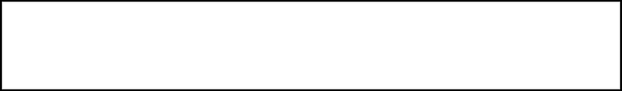
As with everything, start with a frame
Imagine frame as a blank canvas that you can alter to be any component that you desire.
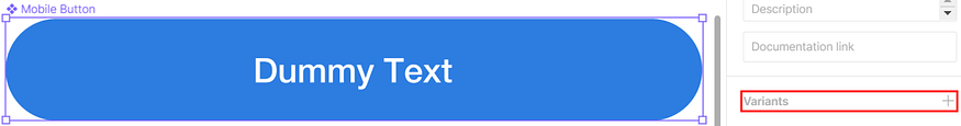
Determine the dimension of the component that you are going to create. Here, I’m creating a button for a mobile device. I outlined the frame so that it could be visible on this page.
After you have created your frame, you can edit it however you want. Here are some actions that you might consider doing:
- Determine the way your component would look in terms of color — Determining the color of the component doesn’t have to be only the main color of the component. You should also consider the stroke and the effects that the component should have. My button doesn’t have a stroke and has no effect as well since this is a primary button.

- Pump up the corner radius to make it more appealing in users’ eyes — By cornering up our component when necessary, it makes our design less rigid and more welcoming. It will also make our design tidier and minimalist. Remember, the maximum value for the corner radius is 50% of the height of the element.

Insert a text field if required
In this case, every button in our application would have many types of text. Hence, we need to create a text field where we can input the kind of text that we would like.

Keep in mind that you need to consider the spacing, the font size, the text and component alignment, and the text box type for your component if you are using a text field.
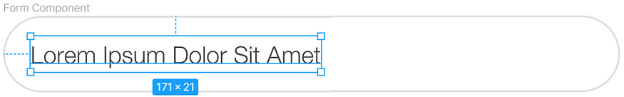
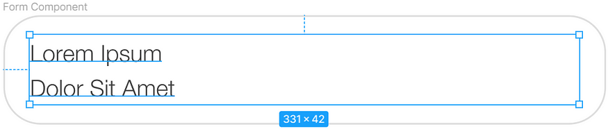
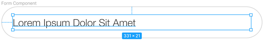
To make it simple, here are examples of the types of text boxes that are available in Figma. I’m using a UI form element as an example.
- Auto width — The text box wraps the text neatly. This type of text box is used when paired with an auto-layout component that expands horizontally to make it seem effortless and doesn’t mess up the positioning of the components inside it.
- Auto height — The text box adjusts itself according to the number of lines that the text will take. We determine the width of the text box. The auto height text box is used together with a component that expands vertically.
- Fixed-size — The name of this text box already defines itself. We use this type of text box when we already know the maximum amount of characters or we have already know the exact size of the components. It is perfect when we want the size of our component to be immutable.
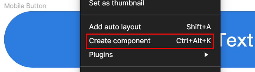
Create the component
Creating the component from the element that we have created is easy. We can just click the create component button or simply click ctrl + alt + k to generate a component quickly from a selected element.
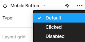
Add variants to enhance design reality with natural gestures
Common gestures that people use when using an application are pressing, hovering, and clicking. After we have created our component, we will have the option to add variants to our component.
It is crucial to pay attention to small details because those details are going to create a tremendous difference when we are creating a prototype out of our components. It would make our design a lot more realistic and alive.
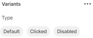
In creating a mobile device button, we should consider three variants, when the button is untouched, clicked, and disabled. I prefer to call the untouched button a default button.
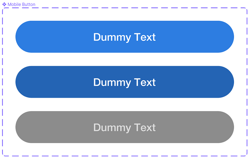
Besides creating the variants and designing them, make sure that you name them properly. Name your variants with a clear meaning, name them as they appear to be. Naming your variants with random names could result in an error in Figma and you would be confused to use it yourself.
Using components in Figma
After we have created the components, we can use them instantly.
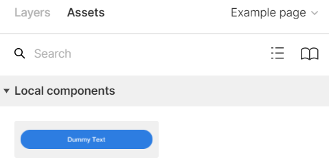
Just drag and drop!
Simply drag the components that we have chosen in the local components section on the assets page. The component would be automatically used.
Choose the appropriate variant
Don’t forget to choose the variant according to the circumstances or the conditions of the screen.