This month all of our web design trends have a common theme – imagery. Whether it’s seasonal or just coincidence, there’s a shift in the styles and types of images on many designs right now. One thing that might push these design trends is a relaxation of COVID-spurred rules worldwide or even fatigue from the pandemic.
Here’s what’s trending in design this month.
1. Little Images Everywhere
The jury is still out on whether we love or hate this design trend – tiny images (and videos) everywhere.
The thing that’s nice is there is a lot to see and interact with. The thing that’s challenging is that these designs can feel a bit unbalanced and all over the place.
Most of these designs feature four or more images or videos at a time. That can be a lot for a user to digest when we are accustomed to having just one thing to look at in the hero area.
Those four or more images then include all of the other user interface elements that you would expect on the page – navigation, large headline, secondary text, scroll, or engagement interaction. It can be a lot to decipher.
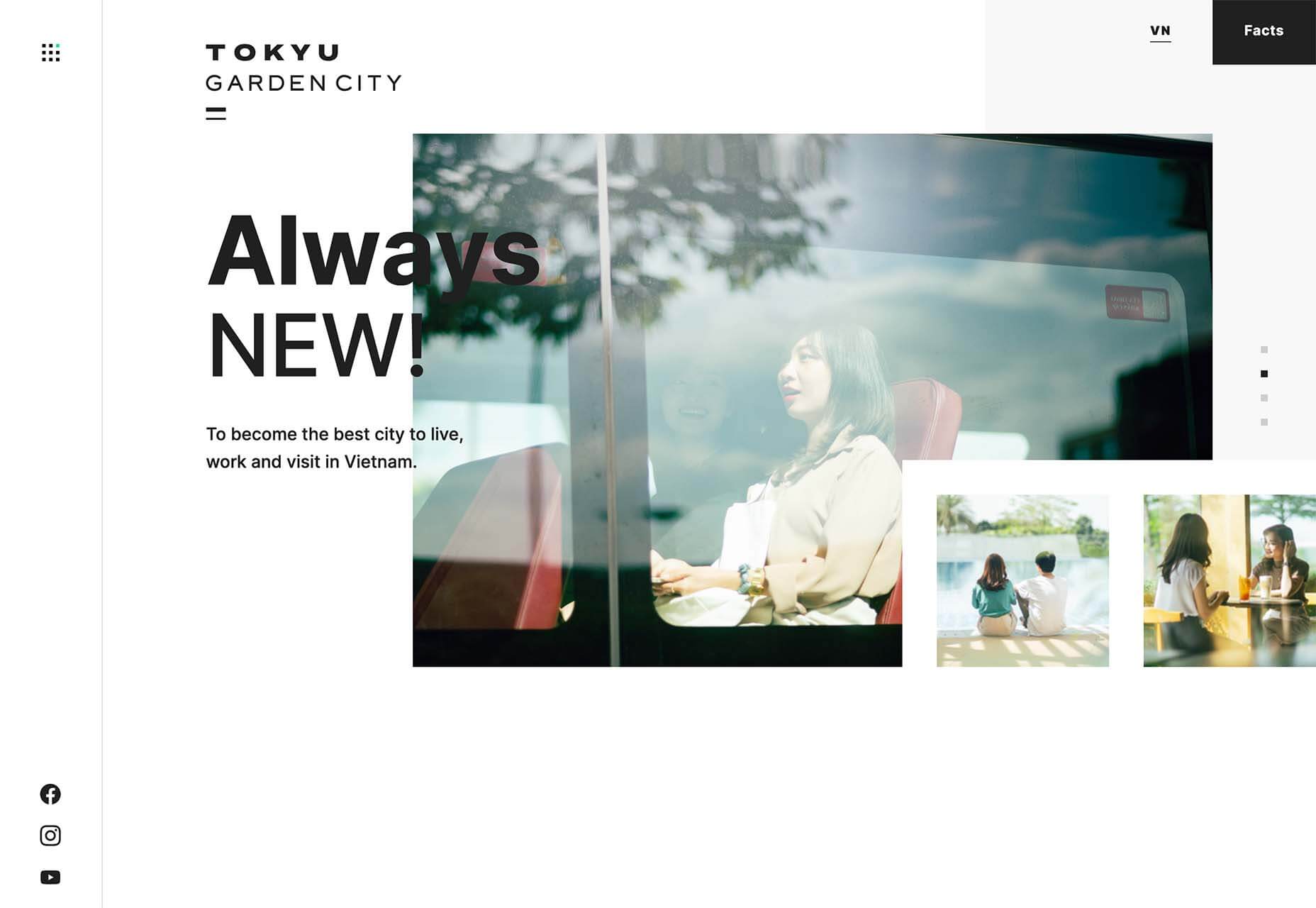
Tokyu Garden City does it with a mix of still and moving images with sliders and other animations. The images are always changing and moving, and there’s constantly something new to look at with movement at the top and bottom of the screen.
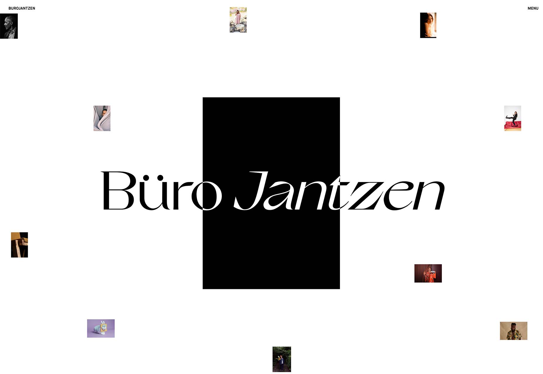
Buro Jantzen takes the tiny image idea to an extreme with ten images on the homepage. And every one is smaller than a postage stamp. There is a cool effect that happens with each image though. On hover, the small image pops into the large black box at a size where you can really see the photo.
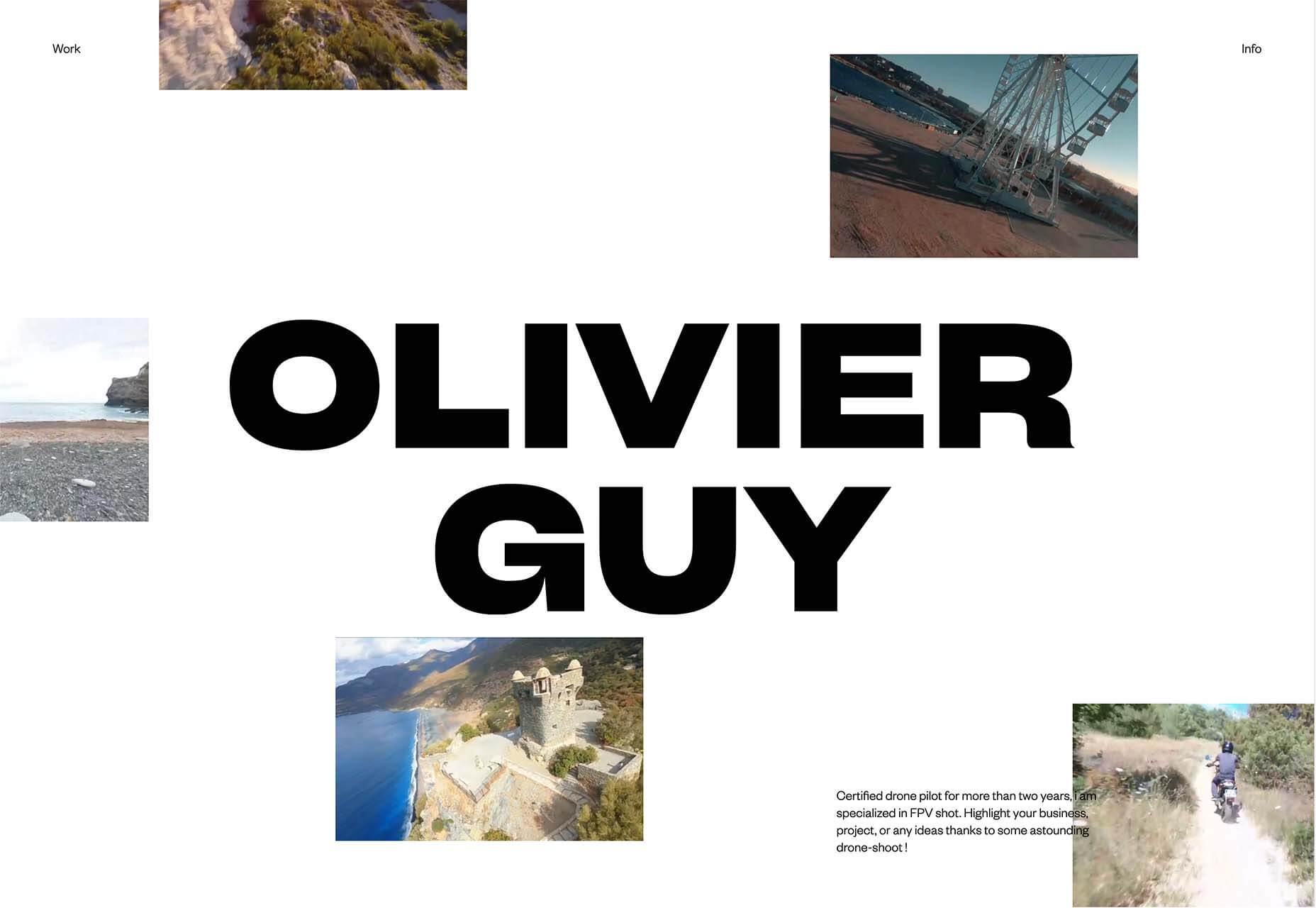
Oliver Guy uses a combination of video images on his website, which makes perfect sense for his industry of drone photography. There’s some interesting hover animation happening that allows you to see additional video clips without leaving the homepage. The contrast of small video on the white background makes this design easy to understand.
2. Big Detail Photography
Photographic details in all their glory. Images and elements that are so in your face that you can see every detail. That’s majorly trending in website design.
Big detail photography and videography is one of those image trends that can be so visually interesting that you can’t look away. It has other benefits, too, such as facilitating decision-making for e-commerce or helping someone better understand what an item is or the overall messaging.
Each of these examples shows something larger than life-size.
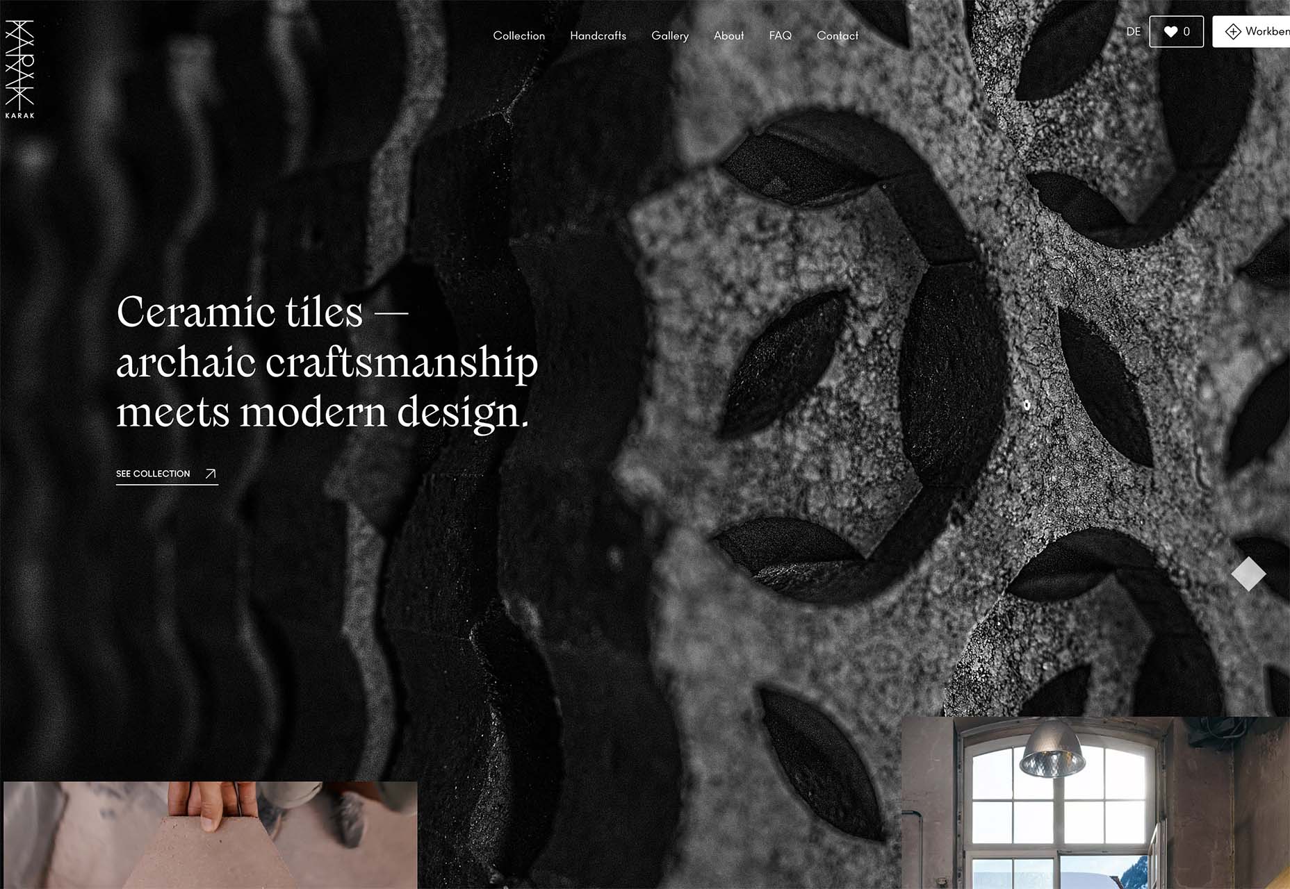
Karak creates ceramic tiles. The primary background image is so big and with such detail that it almost only serves as texture for the design. But it is paired with a smaller image and video that pull everything together for a complete understanding. The big detail image is beautiful and exciting and provides an extra layer of information.
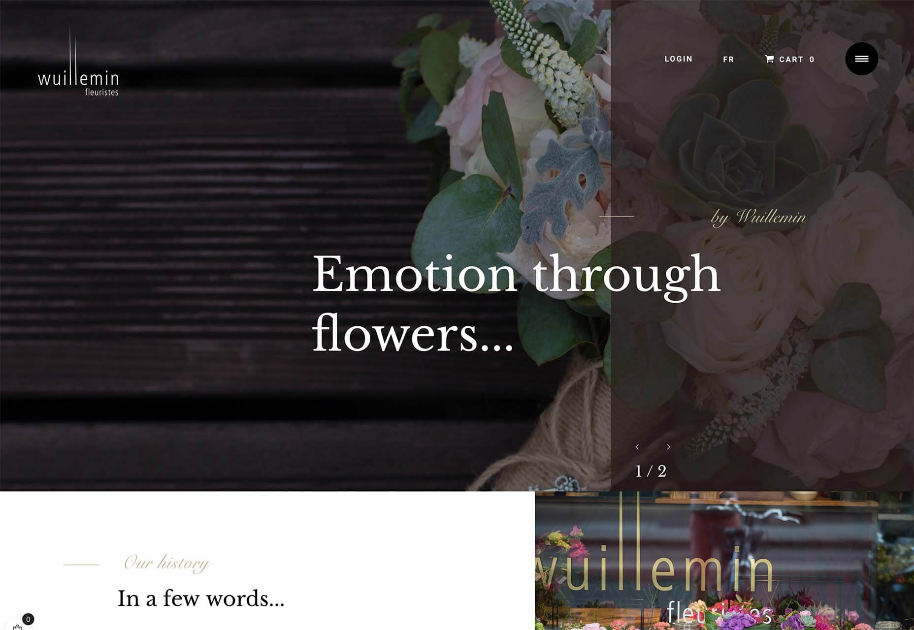
Wuillemin Fleuristes features an off-balanced hero image with a large floral detail. What’s interesting about this design choice for a detail image is that it is the only image on the screen and partially obscured by a tinted box and text element. The overall design draws the eye but may leave the user wanting to see a little more of the image.
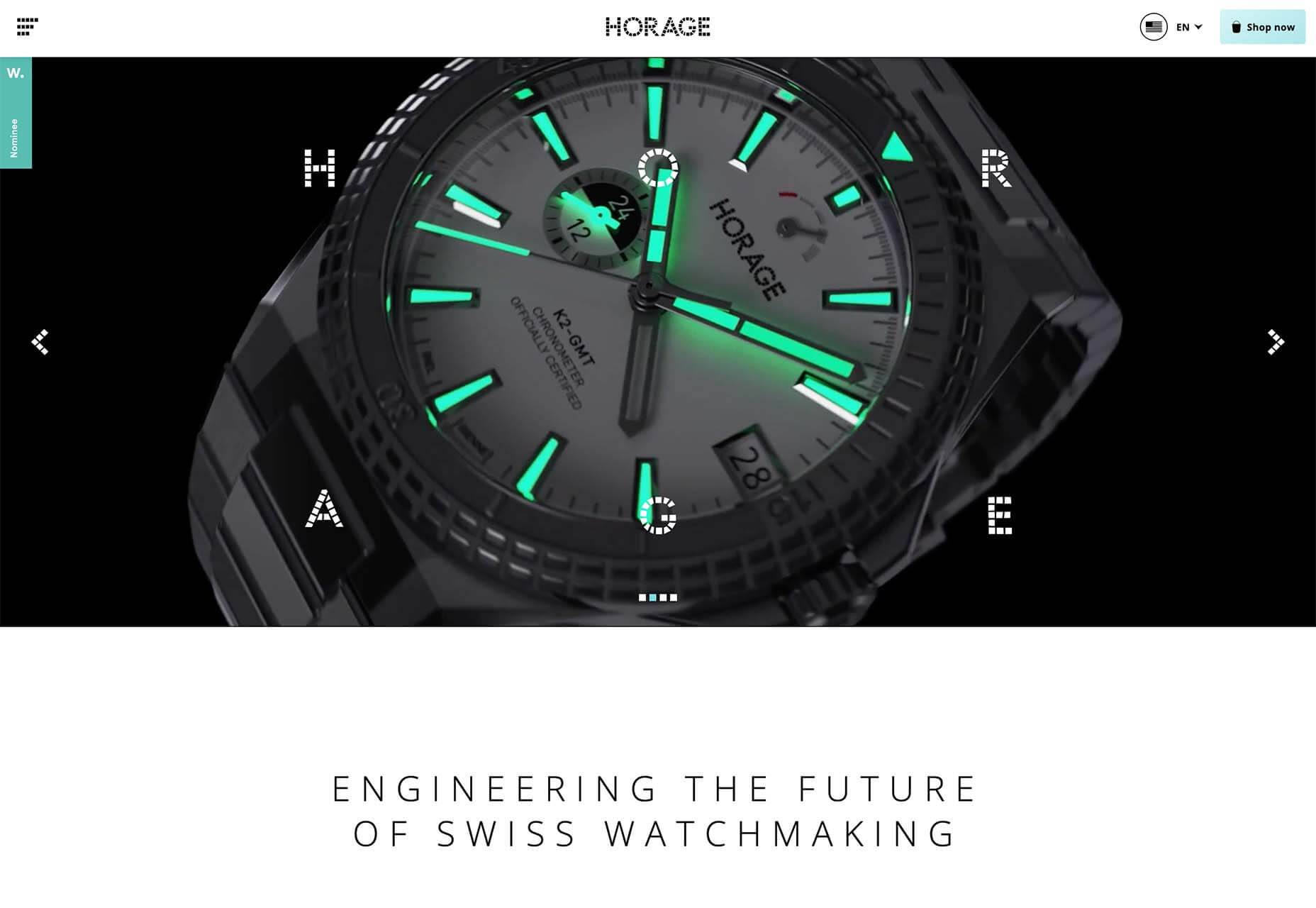
Horage pushes its watch in your face with motion in a video that zooms the product closer and closer into view. The combination of detailed video with very little text is a bold choice for e-commerce and might work because this item is still in the preorder phase. Detailed imaging is designed to help create a desire for the product.
3. Big Faces are Back
After two years of not having that many faces in design projects, designers are going big and bold and showing people again.
One of the reasons we haven’t seen as many faces in design projects is because there was concern over how to show people – masked or maskless, alone or in crowds – and it caused more concern than was worth just going another way.
But projects with big faces are back in a major way. And it’s refreshing to make virtual eye contact again.
There are plenty of ways to do it, as outlined in each of these examples.
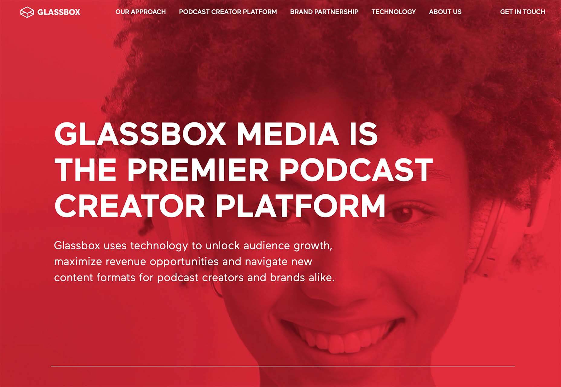
Glassbox Media uses a full-screen oversized video on the homepage. You can see the subject’s eyes and feel engaged with the person on the screen. She seems happy, and the size and scale of the face make you feel almost like you are in a room with her, ready to have a conversation.
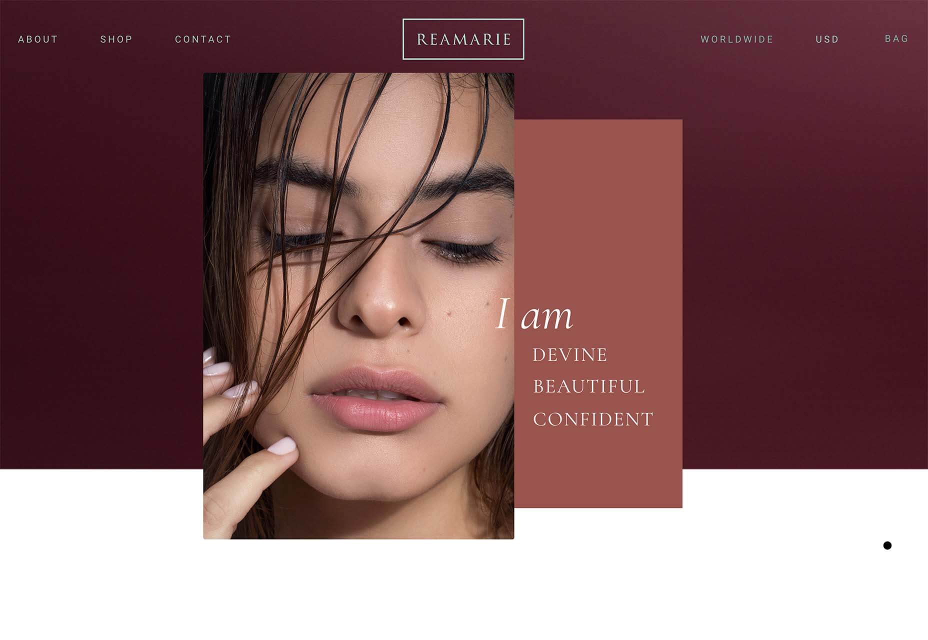
Reamarie uses smaller still images with tight crops to bring you into the faces on the screen. There are more, bigger faces throughout the scroll as well so that the user feels connected to the people and product. Even if an image isn’t super large, a tight crop can make it feel bigger and create the same level of engagement as something that has more size on the screen.
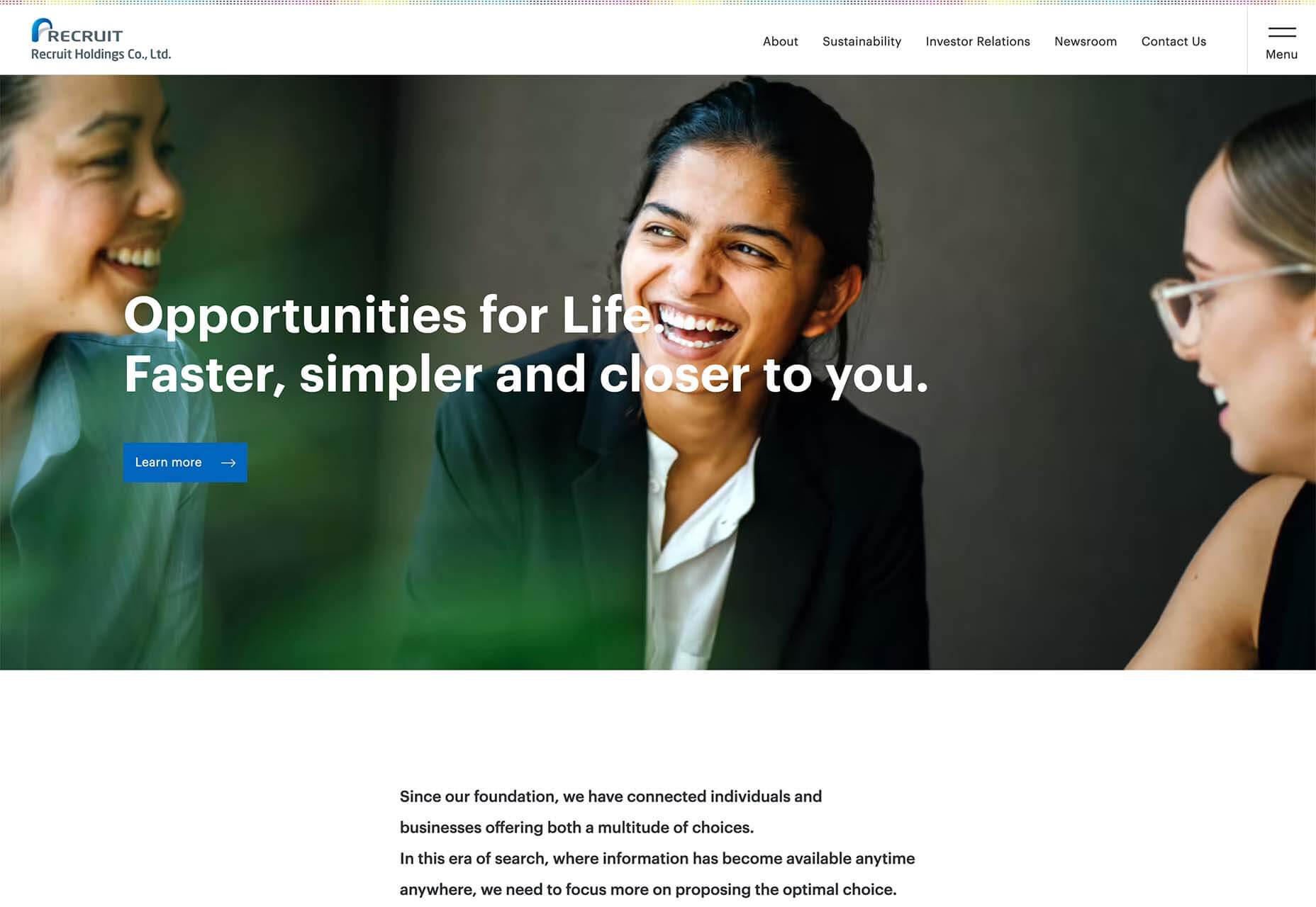
Recruit Holdings Co. uses a trio of people together, happy and smiling, to establish a connection with website visitors. The entire design features similar images throughout and makes you feel like you want to be a part of what they are offering. Note that the people are close together and without masks; that’s a culture shift we are starting to see in a lot of imagery.
